The Info and Appearance section is an important thing to pay attention to. This is where you add your shop banner, announcement, message to buyers and link to your Facebook and/or Twitter account.
There are a few things you want to fill out here:
1. The Shop Title, which appears on your store front right under your name. The title does not have to be the same as your shop name. Think of it as a tiny description of your shop. This can be up to 55 characters long.
2. The Shop Announcement, which appears under the Name and Title. Think of this as a welcome note to your customers. It is often used to promote sales, let customers know that you will be on vacation or other important information. Only the first two lines will be immediately visible. Don't worry if it doesn't all fit. Click "read more" and your whole announcement will open in a window for customers to read.
3. Next, you will want to add a Shop Banner to your store front. Your banner will be one of the first things people see when they come to your store--think of it as a window to your shop. You want it to reflect your store and what you do. For example, my banner matches very much with my business card. See our previous posts on Branding Part 1 and Part 2 for more ideas.
The banner should be 760 x 100 pixels. It helps to start out making your banner with a template of that size so you will know exactly how it looks when it is uploaded.
4. Link to your Facebook and Twitter accounts
Make sure that you are logged into your own Facebook page. The page Etsy will link to will be whoever is logged into Facebook on your current browser, even if the screen isn't open. If you are not logged in, Etsy will give you a prompt to log in. Just make sure you don't accidentally link to someone else's page. (My husband as unknowingly liked a few paged that way!)
Once that's connected, the little "like" and "follow" icons will be added below your shop banner.
5. Message to Buyers
This message will appear as part of the order confirmation when a customer purchases an item from your shop. It's a nice little way to thank your customers.
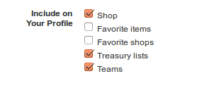
6. This is also a good time to make sure your Public Profile is filled out.
Your public profile is just that - public. Everyone on Etsy has one whether they are a buyer or a seller. It's a good way to draw the customer to you, as a person. Even though a lot of the information may be similar, it is a good idea to fill in both your Public Profile as well as the About Page. Check out this post to learn more about the About page.
See that little icon on the left side bar of my shop? That's your public profile image.
This image will represent you, as a person, to the online Etsy world. It will represent you in the forums, in reviews and messages. This image should be 75 x 75 pixels. Again, it's easiest to start with a template of that size so your image doesn't get distorted when it's uploaded.
A lot of the public profile is optional, but it's a good idea to have it filled in. Location, for example, helps people to find you locally.
Now that we have our shop looking all spiffy, tune in next Thursday to learn how to List an Item!
Andrea Davis resides in Winnipeg. A proud member of WEST for 2 years and the owner of "We Are Bound Together", a shop where 100% of the proceeds go to charities. Check out her shop, or blog.


No comments:
Post a Comment
Thanks for stopping by and leaving your comment!